This one is theory, not my own benchmark. It’s my reading of two Netflix posts that taught me how to look at a flame graph: Java in Flames and Saving 13 Million Computational Minutes per Day. The numbers and the story are theirs. I’m crediting them up front and using my own drawings so I’m not lifting anyone’s images. If you want measured flame graphs I captured myself, that lab is elsewhere on this site.
If you’ve ever stared at a service pinning a core, watched top tell you it’s “busy,” and had no idea what it was busy doing, this is the picture that fixes that. CPU% tells you the machine is busy. It says nothing about what your code is busy doing, and once you’ve read a good flame graph you stop guessing at the difference.
The problem
A profiler samples the stack a few hundred or a few thousand times a second. Each sample is a full call stack, top to bottom, a frozen answer to “what was this thread doing right now.” Do that for thirty seconds and you have tens of thousands of stacks. The problem was never collecting them. The problem is that tens of thousands of stack traces is an unreadable wall of text, and the thing eating your CPU is hiding inside it as a frame that shows up in, say, 40% of the samples but is buried under a hundred different call paths that lead to it.
You want the answer to one question: which function was on CPU the most, and how did the code get there. A flat list of hot functions can’t tell you the second half, it loses the call context. A flame graph keeps both.
What the picture actually is
Take every stack, stand each one up as a tower of boxes with the entry point on the bottom and the on-CPU function on top, then merge the identical towers together. Boxes that share the same call path fuse into one wider box. That’s the whole trick. Netflix put it in one line: “The y axis is stack depth, and the x axis spans the sample population.”
Two things fall out of that, and they’re the only two you really need to hold onto:
- Width is the answer. The x-axis is not time. It’s how many samples that frame appeared in, so a box that’s half the width of the graph was on CPU, directly or through something it called, in half your samples. Wide means expensive. Netflix’s advice is exactly this blunt: “Focus on the widest functions, which were present in the profile the most.”
- Height is just how you got there. Stacking upward is parent calling child. A tall tower isn’t slow, it’s deep. Only the top edge of the graph is a function actually running on CPU. Everything under it is on the stack, waiting for its child to return.
How to read one: width is CPU, height is call depth
Pattern.match is the widest box on the top edge, so it's where the CPU actually went, and you can read straight down the tower to see it was reached through parseJson → handleRequest → main. Netflix's colors carry the same idea: green for Java, yellow for C++, red for system code, intensity randomized just to tell neighbours apart.You can walk it bottom-up, following code from parent to child the way it ran, or top-down, reading the top edge as the list of things burning CPU right now. Same graph, two directions. Netflix uses both, and a third one I’ll get to.
Why Java couldn’t draw one for years
Here’s the part that surprised me. Linux has had a solid sampling profiler for a long time, perf, and for a C or C++ service you point it at a running process and it just works. Java was invisible to it, and for two separate reasons that both had to be fixed before any of the above was possible.
The first is names. The JVM compiles methods on the fly, “just-in-time,” so the machine code for handleRequest didn’t exist when the process started and isn’t in any symbol table perf knows how to read. The profiler sees an address, not a method. The fix is a small JVMTI agent, perf-map-agent, that gets the JVM to dump a /tmp/perf-PID.map file mapping those JIT’d addresses back to method names, sizes, and hex offsets. Now the addresses have names.
The second is worse, and it’s the one I find genuinely interesting. To walk a stack cheaply, the profiler follows a chain of frame pointers, one register (RBP on x86-64) that each function is supposed to leave pointing at the previous frame. The JVM, chasing speed, reclaimed that register and used it as a general-purpose one. Faster code, but the stack-walk chain is broken, so perf would grab the top function and then fall off a cliff. No tower. Just a floor.
The fix was a JVM flag, -XX:+PreserveFramePointer, that keeps RBP doing its actual job so the chain stays intact. It isn’t free, Netflix measured it at “between 0 and 3% extra CPU, depending on the workload,” which is a real cost you pay to be able to see anything at all. Even then some frames vanish into inlining, the graph “looks perhaps one third as deep” as a full jstack, but as they put it, “enough remain that we can figure out what’s going on.” A few percent of CPU to be able to profile the other ninety-seven is a trade I’d take every time.
The read that found 25 years a day
The payoff post is the one about a CPU-bound microservice, and what I like about it is that the obvious readings didn’t work. Bottom-up, the lower frames were all framework code, the application logic only showed up near the top with a couple percent each, nothing to grab. Top-down, the widest leaves were “map get/put calls,” which is true and useless, every service on earth spends time in hash maps.
So they did the third thing: middle-out. Collapse the framework frames, filter down to the application’s own packages, and re-merge. Now one package stood out at “almost 44% of CPU samples,” and inside it a single legacy method was sitting on “25% of CPU samples” all by itself. That method already had a dynamic flag to turn it off, and when they checked, it “no longer returns distinct results.” It was dead weight that nobody had noticed because nobody could see it. They flipped the flag on a canary and watched CPU and latency both drop.
Before and after, as a share of all CPU samples
The headline is the arithmetic on the other side of that flag. One dead method, gone, “reduces the service’s computation time by more than 13 million minutes (or almost 25 years) of CPU time per day.” Not per year. Per day. That’s the shape of a fleet: a small percentage of a lot of machines is an absurd number, and the only reason anyone found the method to delete is that a flame graph made 25% of the samples point at a single name.
A real one, for shape
Everything above is Netflix’s story and my own diagram. If you want to see a genuine captured Java flame graph, here’s one I profiled myself on a regex that backtracks on every non-matching log line:
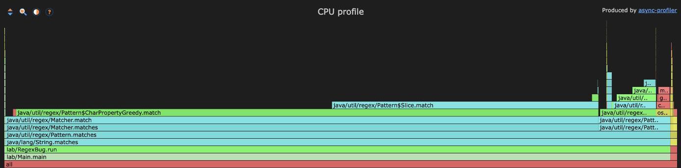
Same reading rules. The two widest boxes on the top edge, CharPropertyGreedy.match and Pattern$Slice.match, are about 88% of the samples between them, and you can read straight down to String.matches to see how the code got there. That’s the whole lab, numbers and all, if you want measured instead of borrowed.
The takeaway
A flame graph converts “the CPU is busy” into “the CPU is busy doing this specific, nameable thing, reached this specific way,” and that second sentence is the only one you can act on. Read it by width, not height, and remember the top edge is what’s actually running.
Two things worth keeping:
- Getting a language into the profiler can be its own project. For Java that meant naming JIT’d methods and paying 0 to 3% CPU to keep the frame pointer honest, and it was worth every fraction of a percent. If your runtime shows nothing useful in
perf, that’s usually the problem, not the absence of one. - The obvious reads miss the win. Bottom-up drowned in framework, top-down drowned in hash maps, and the 25% method only appeared once they filtered to their own code and looked in the middle. When a flame graph looks like it has no answer, try collapsing the frames that aren’t yours before you conclude there’s nothing there.